Summary
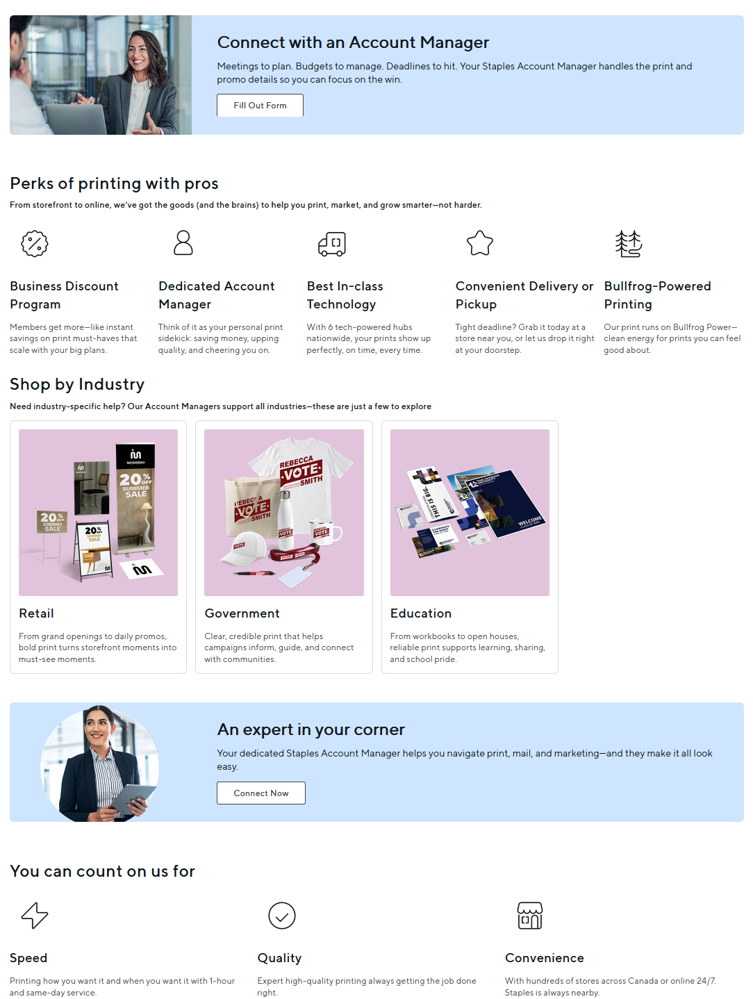
Staples Print had a discoverability problem: CSAT feedback showed that customers were struggling to navigate to the products and services they needed. I audited the existing header architecture, mapped navigation items against click data, and restructured the hierarchy around actual customer behavior.
I clarified ambiguous categories, introduced a more scalable taxonomy for services, occasions, and industries, and validated changes with real-time data.
The work contributed to a clearer path to products and offers as part of broader journey improvements that increased site usability and CSAT.
Context
Product
Staples Print is an e-commerce experience serving customers looking for print products and services, ranging from document printing and business cards to calendars, envelopes, and event-related materials.
Audience
The audience includes both B2C and B2B customers, from enterprise owners and small businesses to someone planning a birthday party.
Business goal
Make it easier for customers to move from the homepage and navigation into relevant product categories while improving the discoverability of revenue-driving products.
Constraints
I was working within an existing site architecture and established product catalogue, so the solution needed to improve discoverability without requiring a complete redesign of existing landing pages or product-detail pages.
Problem
User problem
CSAT feedback indicated that customers were having difficulty getting where they needed to go.
When I reviewed the navigation, I found that the hierarchy did not always reflect how customers were actually using the site. High-interest products could be buried below lower-engagement categories, while some labels grouped together content that did not logically belong together.
The structure was effectively asking users to adapt to the navigation rather than allowing the navigation to reflect user behavior.
Business impact
Poor navigation had implications beyond usability. It could:
- Add friction before customers reached product pages.
- Reduce visibility for high-demand categories.
- Make promotional or seasonal products harder to discover.
- Create an information architecture that became increasingly difficult to scale as new categories were introduced.
Evidence
CSAT feedback
Customers were explicitly reporting difficulty navigating the experience.
IA Audit
I mapped the existing header into a navigation tree to understand hierarchy, naming conventions, duplication, and category relationships.
Click data
I mapped individual navigation links against engagement data to understand whether their visual priority matched actual customer demand.
Key Insight from Research, Feedback and Data
Navigation reflected the catalogue more than the way customers actually shopped.
High-interest products were buried beneath lower-engagement items. Instead of simply changing individual labels, the navigation needed a clearer hierarchy built around both behavioral data and customer mental models.
“What services are offered online versus in-person?”
“I don’t know how to find things if it’s not on the homepage. I see many things around, but I don’t feel motivated to browse when the same thing is repeated on all dropdowns.”
The goal was to reduce the number of clicks between what users wanted to see and how they navigated there.
Solution
Reprioritize navigation based on customer behavior
Preserve the existing order
Keep the existing merchandising hierarchy and make only cosmetic changes.
Reorder using internal assumptions
Prioritize categories stakeholders considered strategically important.
Use behavioral data
Compare click activity and elevate categories customers were already demonstrating stronger intent toward.
Navigation position creates implicit priority. If a high-demand category requires users to scan past several lower-demand options, the interface introduces unnecessary friction.
Using behavioral data gave me a defensible way to decide which categories deserved greater visibility rather than relying only on existing placement or assumptions.
The goal was not to mechanically sort every item by clicks, but to use engagement data alongside merchandising and business context to make better hierarchy decisions. Every reorder was verified by the business team, who sometimes needed certain titles to remain in their existing positions.
An Iterative Navigation Rollout
Rather than restructuring the entire navigation at once, I broke the work into four phases, with bi-weekly check-ins to review performance, validate changes, and make sure we were moving in the right direction.
This allowed us to improve the navigation progressively — starting with low-risk language changes before moving into larger structural changes to hierarchy and taxonomy.
Phase 02: Make same-day printing explicit
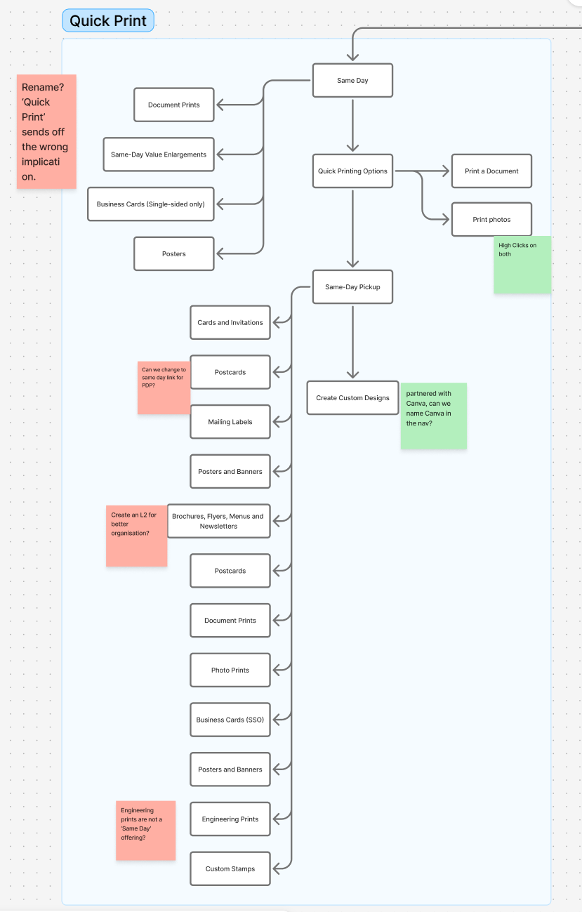
Turn “Quick Print” into a clearer, intent-driven destination.
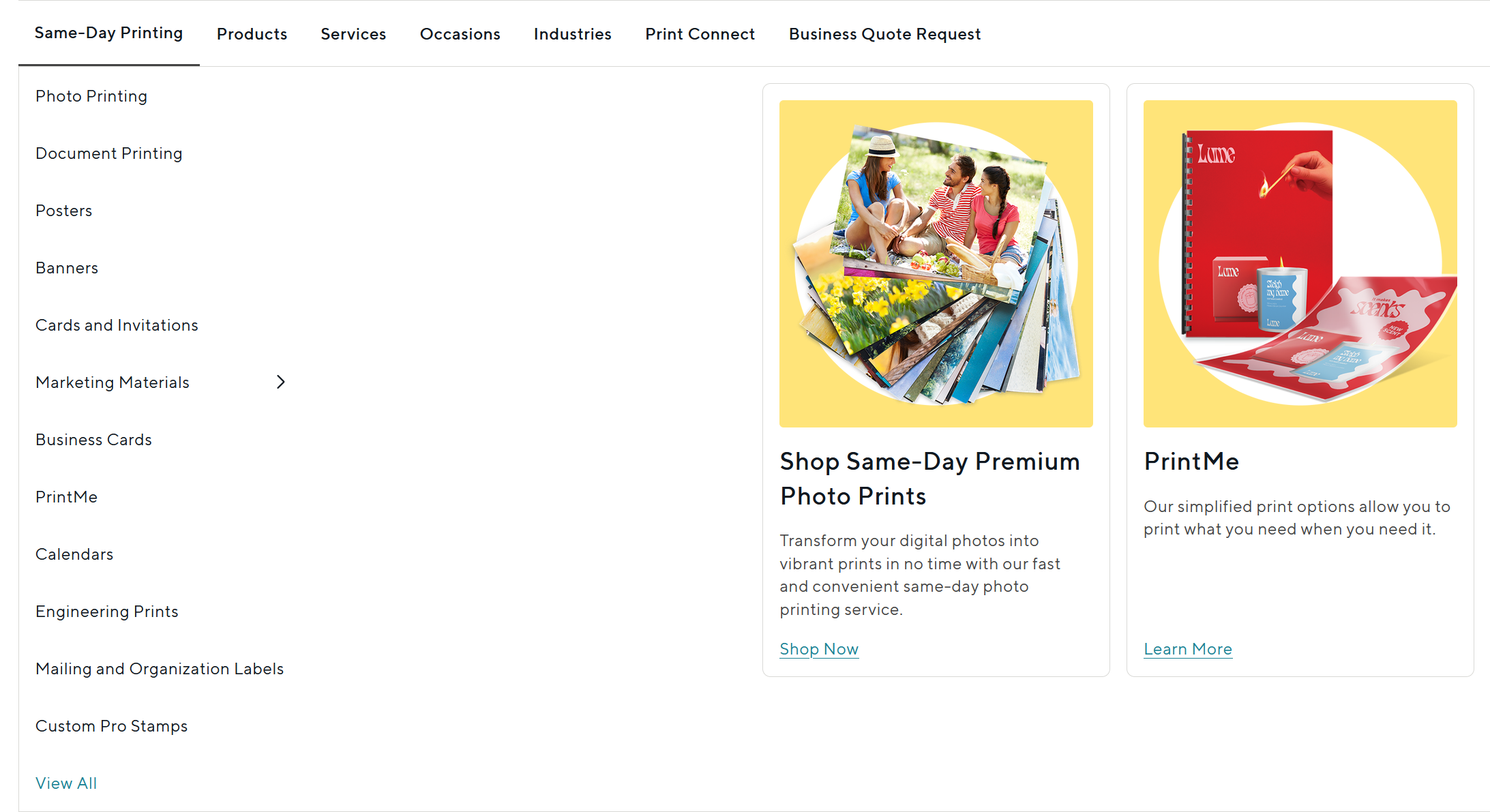
Next, I reworked Quick Print into Same-Day Printing to better communicate what customers could expect from the category.
I also reviewed its L2 and L3 links and redirected relevant paths to their corresponding same-day product pages, creating a more consistent journey between what the navigation promised and where customers landed.
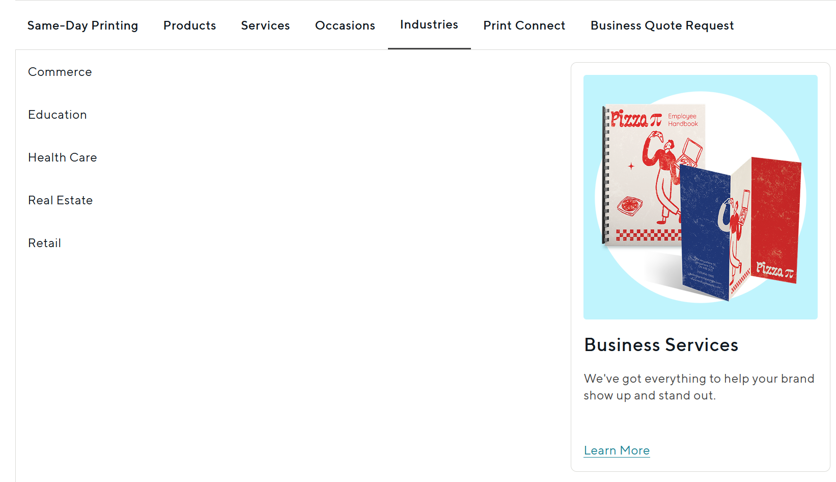
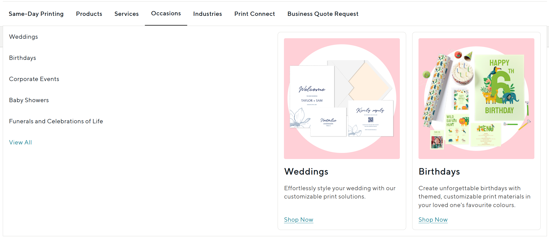
Phase 03: Separate occasions from industries
Untangle two different shopping needs that had been grouped together.
The existing Shop by Events category mixed occasion-based shopping with industry-specific pages, even though customers approaching the site for a wedding have a very different intent from a real-estate or education customer.
I renamed the category Occasions, grouping needs such as Weddings and Birthdays together, while moving industry-focused content into a dedicated Industries section.
This created a clearer distinction between occasion-led consumer journeys and industry-focused business journeys, making each path easier to understand at a glance.
Validation
Method
- CSAT feedback
- Navigation click data
- Adobe Analytics / GA4 performance monitoring
- Ongoing observation of page and navigation performance
Changes made
- Reordered high-value navigation items.
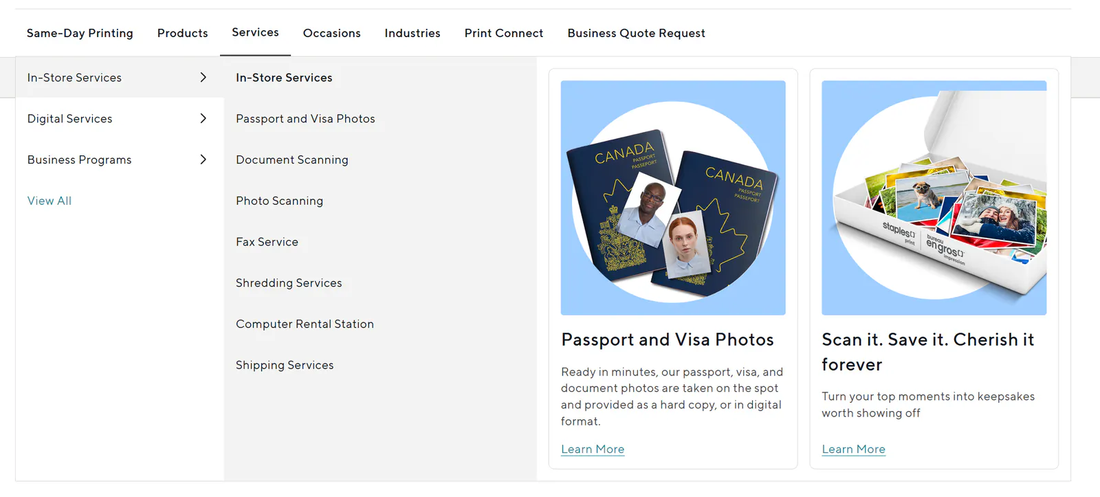
- Simplified category naming from Quick Print, Shop by Products, Shop by Services, and Shop by Events to Same-Day Printing, Products, Services, and Events.
- Introduced Occasions and Industries as distinct concepts instead of grouping them under Shop by Events.
- Redistributed existing pages into the new hierarchy.
- Added category landing pages where stronger destinations were needed.
- Continued monitoring performance to inform further optimization.
Outcome
User result
Customers received a clearer navigation experience where commonly sought products were easier to discover and category names better reflected what they could expect to find inside.
Business result
The redesign gave high-interest product categories greater visibility while creating clearer paths toward product and campaign pages.
The navigation redesign contributed to a broader set of customer-journey improvements that increased measured site usability by 60% and improved CSAT.
Related Contributions
Supporting landing pages
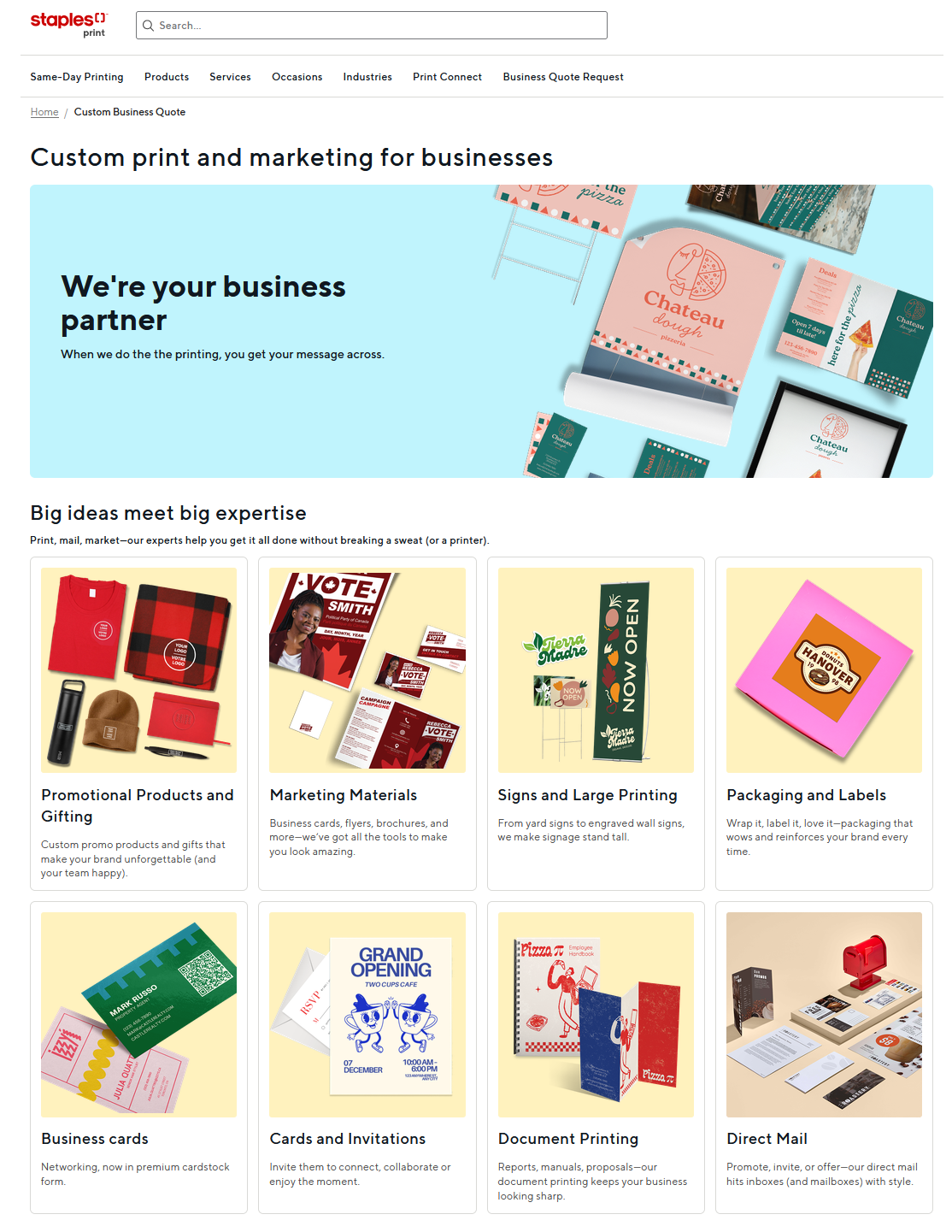
The navigation work surfaced places where a destination either did not exist or was not strong enough to support the customer journey.
I created new product-category landing pages for Calendars and Envelopes, allowing the navigation to lead customers to purpose-built destinations rather than relying solely on deeper catalogue pages.
Your Local Print Shop (YLPS)
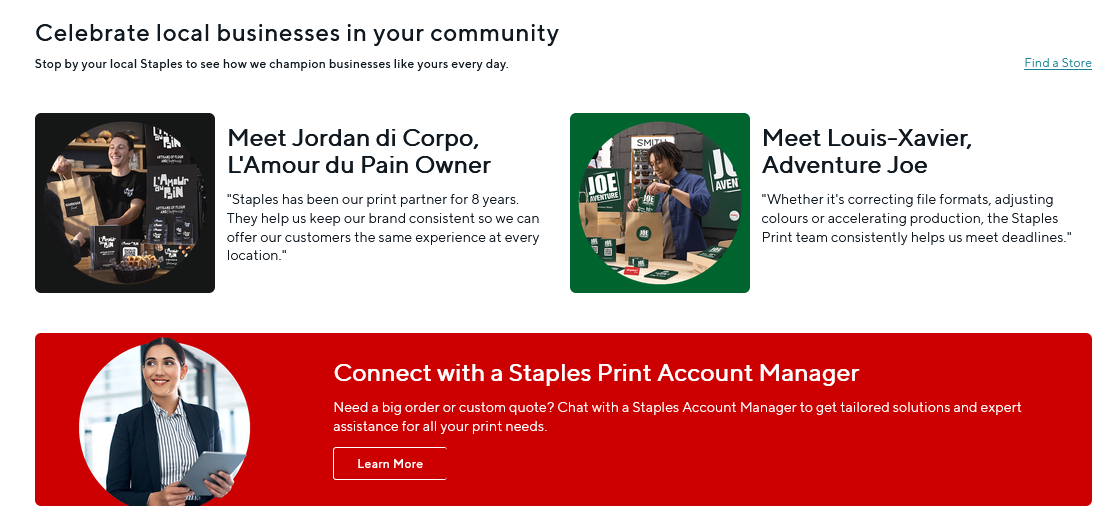
I led the cross-sell strategy for the Your Local Print Shop campaign landing page, extending Staples Print beyond its traditional B2C audience and making its print and design services more visible to small and medium-sized businesses across Canada.
I also created feature placements across the YLPS page and cross-sell sections on related pages, helping customers discover the campaign from more points in their journey.
SEO
I improved SEO implementation across Staples Print by strengthening page structure, metadata, and content alignment. This helped key category and campaign destinations communicate their purpose more clearly to search engines while supporting a more consistent experience for customers arriving from search.