Summary
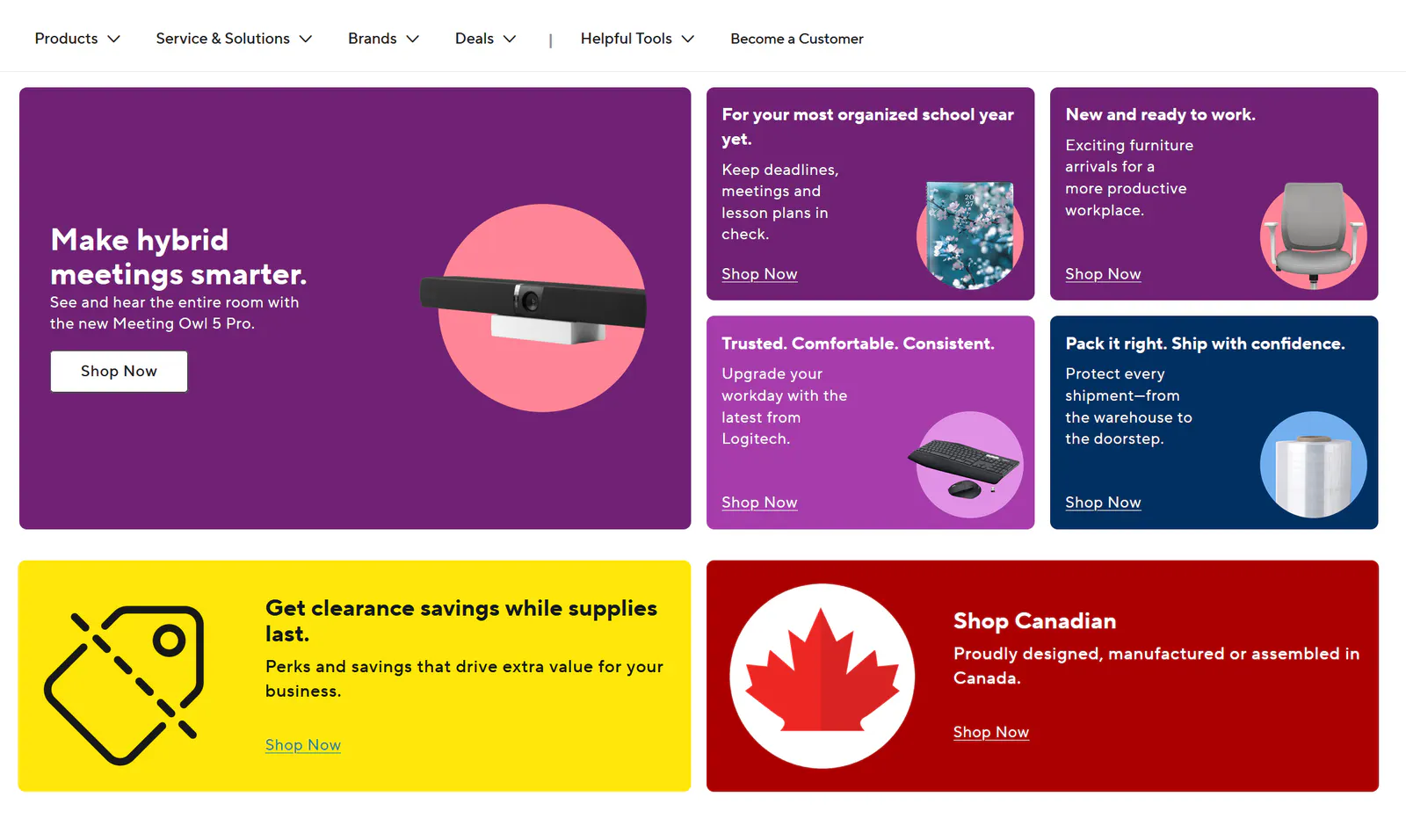
The legacy homepage placed promotions, account actions, and product discovery in competition with one another, making the next step less obvious for both returning customers and first-time visitors.
As the homepage moved from CMS-D3 to Contentful, I worked across Product, UX, and Development to restructure the experience around clearer shopping paths, migrate and validate 20+ reusable components, and prioritize issues based on their potential impact on conversion.
Context
Product
Eway is Staples Professional’s B2B e-commerce platform for workplace products, services, and account-specific purchasing.
Audience
Eway’s customers include employees, procurement teams, and business buyers purchasing workplace products in bulk for their organisations.
Two homepage states, two different jobs
Pre-login
Help customers understand what Eway offers and give them a clear way to begin shopping.
Post-login
Surface account-specific products, promotions, order history, preferences, and relevant recommendations.
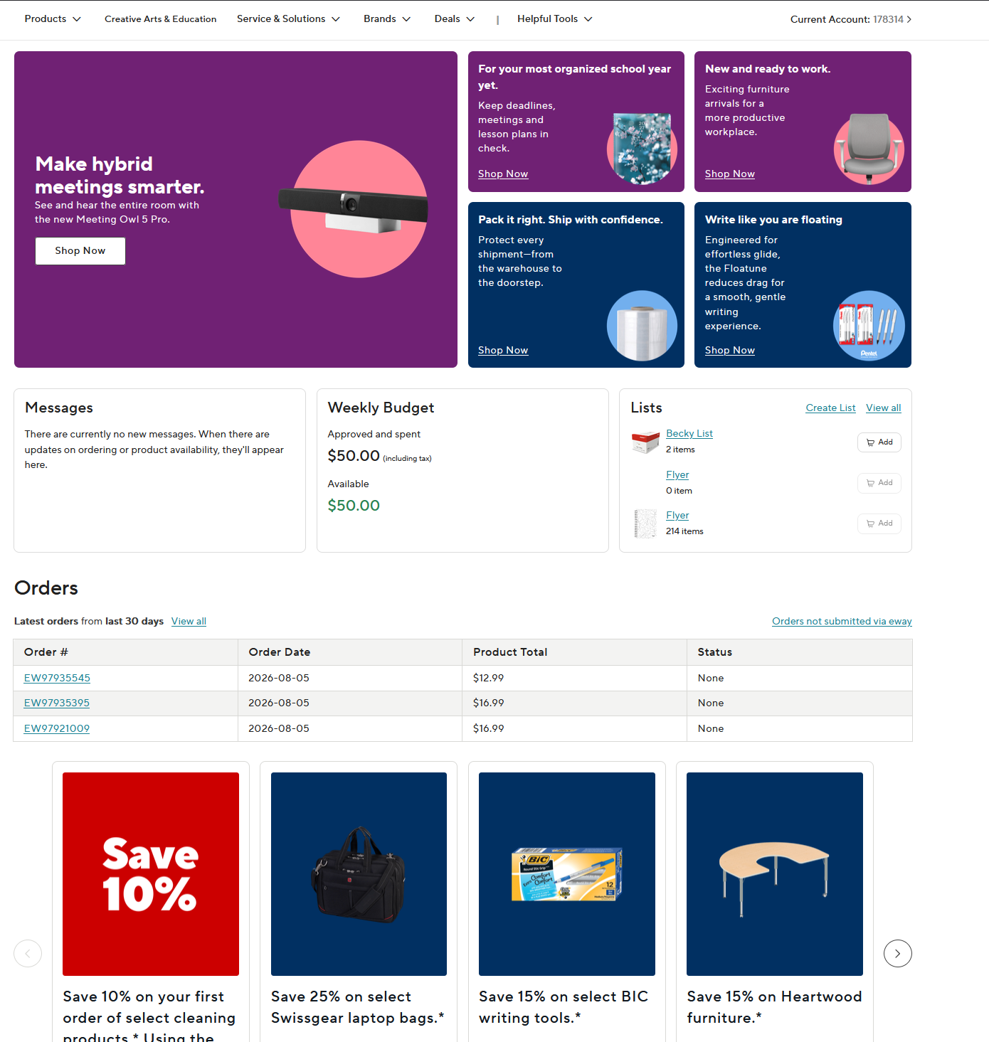
The redesign had to support both states while preserving account-level personalization, pricing, availability, and weekly merchandising requirements.
Business goal
The project had two interconnected goals:
- Migrate the homepage from the legacy CMS into Contentful without disrupting important shopping journeys.
- Redesign the homepage so customers could understand what Eway offered and find a clear next step more quickly.
Constraints
- The homepage had to support both authenticated B2B customers and guest shoppers.
- Pricing and availability depended on the customer’s account, preferences, location, or shopping state.
- Content, design, and development work were happening across multiple teams.
- Components needed to work across desktop, tablet, and mobile breakpoints.
- Some components were still being refined while landing pages were being populated and UAT was underway.
- The team had to support weekly turnover on the legacy and new CMS in case the migration was delayed.
Problem
User problem
The homepage had content, but no clear starting point.
Returning customers wanted the fastest route back into their account. New visitors needed to understand what they could buy and whether they could browse without signing in.
Promotions, navigation, sign-in, and product discovery were all competing for attention, leaving the homepage without a clear hierarchy of next actions.
Can I shop without an account?
Where do I start looking for products?
Do I need to sign in before I can explore?
Business impact
When a homepage does not clearly communicate its primary actions, customers may spend more time interpreting the interface instead of moving into the shopping journey.
For Eway, that could affect several conversion steps:
- Search engagement
- Sign-in starts
- Guest-shopping starts
- Category click-through
- Product-page visits
- Add-to-cart progression
The legacy CMS also created an operational challenge. Homepage updates had to be migrated into a new system while maintaining consistent layouts, content, and responsive behaviour.
What I looked at
Existing homepage audit
I reviewed the legacy page to understand which modules were competing for attention, where customers could enter the shopping journey, and how promotional content was prioritized.
Customer feedback
Feedback suggested that customers wanted more freedom to browse products and promotions before committing to sign-in, while others struggled to understand what services were available through Eway.
Migration and UAT findings
As components moved into Contentful, I documented functional, visual, and responsive issues that could interrupt important customer paths.
Key insight
The migration gave us an opportunity to stop treating every homepage element as equally important. Instead, I focused the redesign around the actions that moved customers closer to shopping: search, sign in, shop as a guest, or browse by category.
I don’t want to log in before I scroll deals, I just want to see what is on sale today.
There’s too much random content, what services can I take advantage of if I sign up?
The goal was to reduce the effort required to understand what to do next.
Designing the migration as a system
Rather than recreate the legacy homepage section by section, we mapped the experience into reusable Contentful components. I documented how legacy modules translated into the new system and tested each component across different content configurations.
Prioritizing what could break the journey
With more than 20 homepage components moving into Contentful, defects varied significantly in severity. I created a practical prioritization approach based on how directly an issue could interrupt a customer’s ability to continue shopping.
Balancing customer hierarchy with business value
Improving the customer journey didn’t mean ignoring merchandising goals. Vendor-funded placements were an important part of the homepage business model, but lower-page mosaic placements typically received fewer than 15 clicks per day.
We introduced a dedicated vendor banner that preserved paid visibility without allowing sponsored content to compete with the homepage’s primary shopping actions.
Final solution
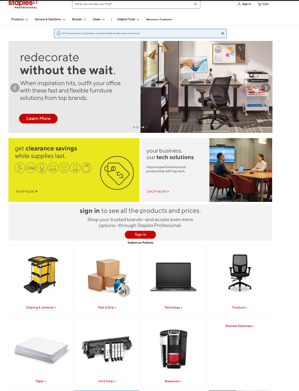
Before
A campaign-led homepage with competing entry points
- Promotions
- Account actions
- Product discovery
- Vendor content
- Services
Everything asking for attention at once.
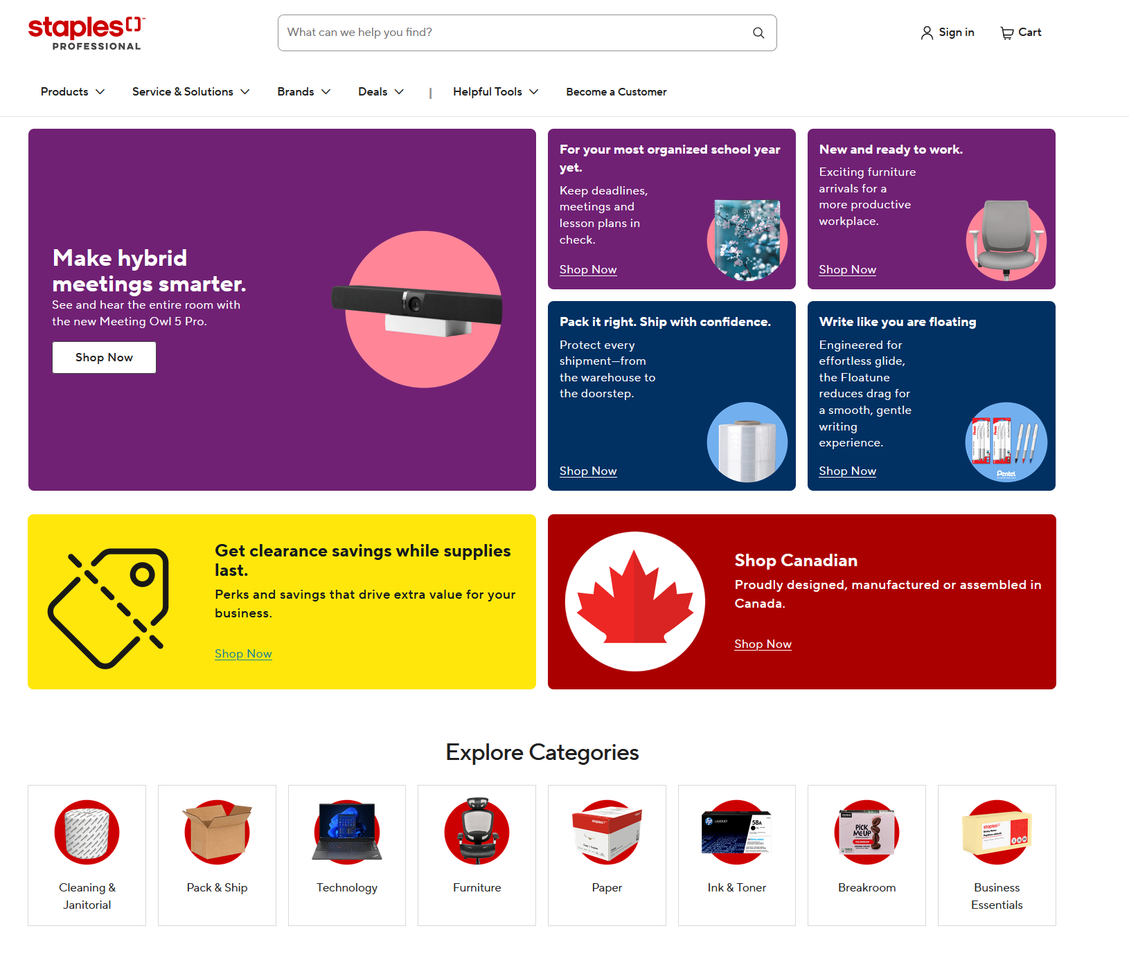
After
A shopping-led homepage with a deliberate sequence
- I know what I need → Search
- I’m ready to shop → Sign in / Guest
- I want to browse → Categories
- I want to explore further → Brands & Services
Validation
I worked with Product, UX, and Development during UAT to review more than 20 migrated homepage components.
My validation process included:
- Comparing implemented components with approved designs and content requirements.
- Testing links, buttons and primary customer routes.
- Reviewing different content configurations.
- Testing components across desktop and mobile breakpoints.
- Recording functional, visual and responsive defects.
- Communicating the customer and business impact of each issue.
- Retesting corrected components to confirm that fixes worked as expected.
Functional defects
Some interactions or content configurations did not behave as intended.
URL links had a character limit of 256
- The links we created for certain vendor banners involved search queries and tagging. This made the links long enough to sometimes exceed the 256-character limit.
- We had no way to create vanity links.
- If this issue was not fixed, we would not be able to run certain campaigns.
Custom settings injection
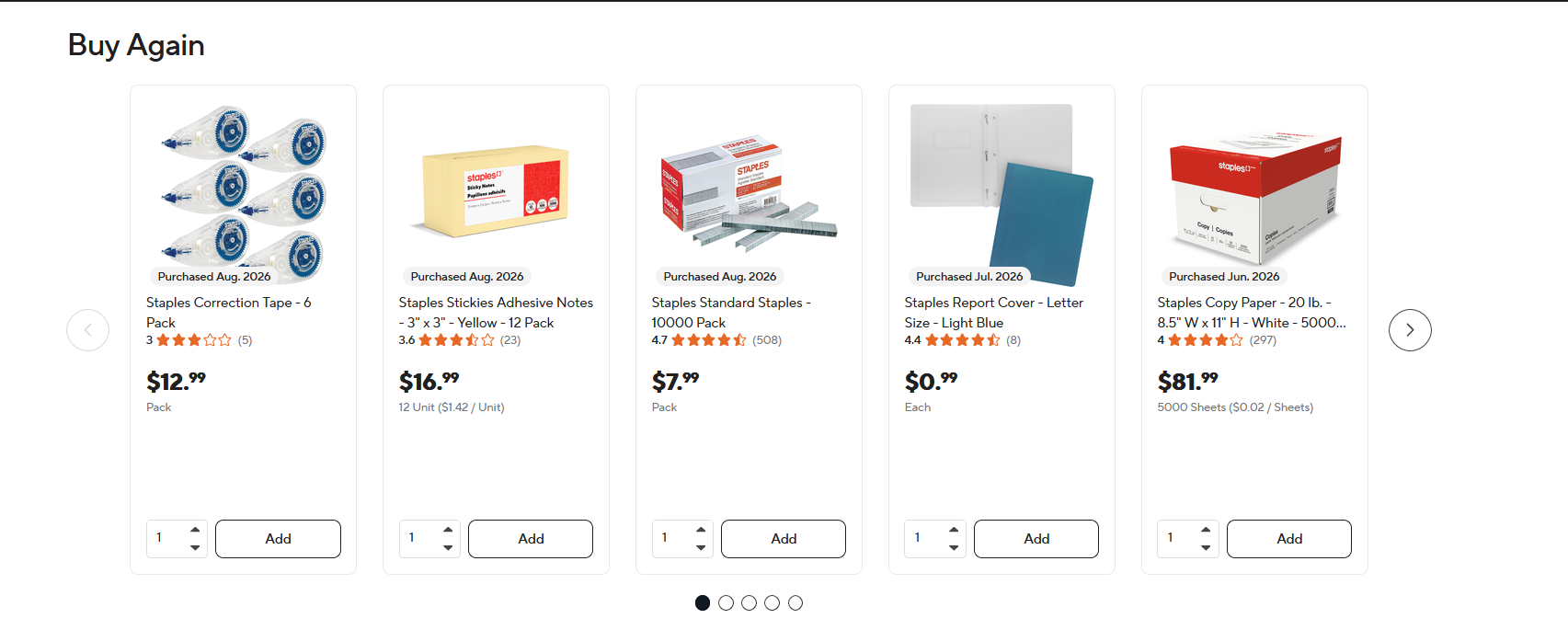
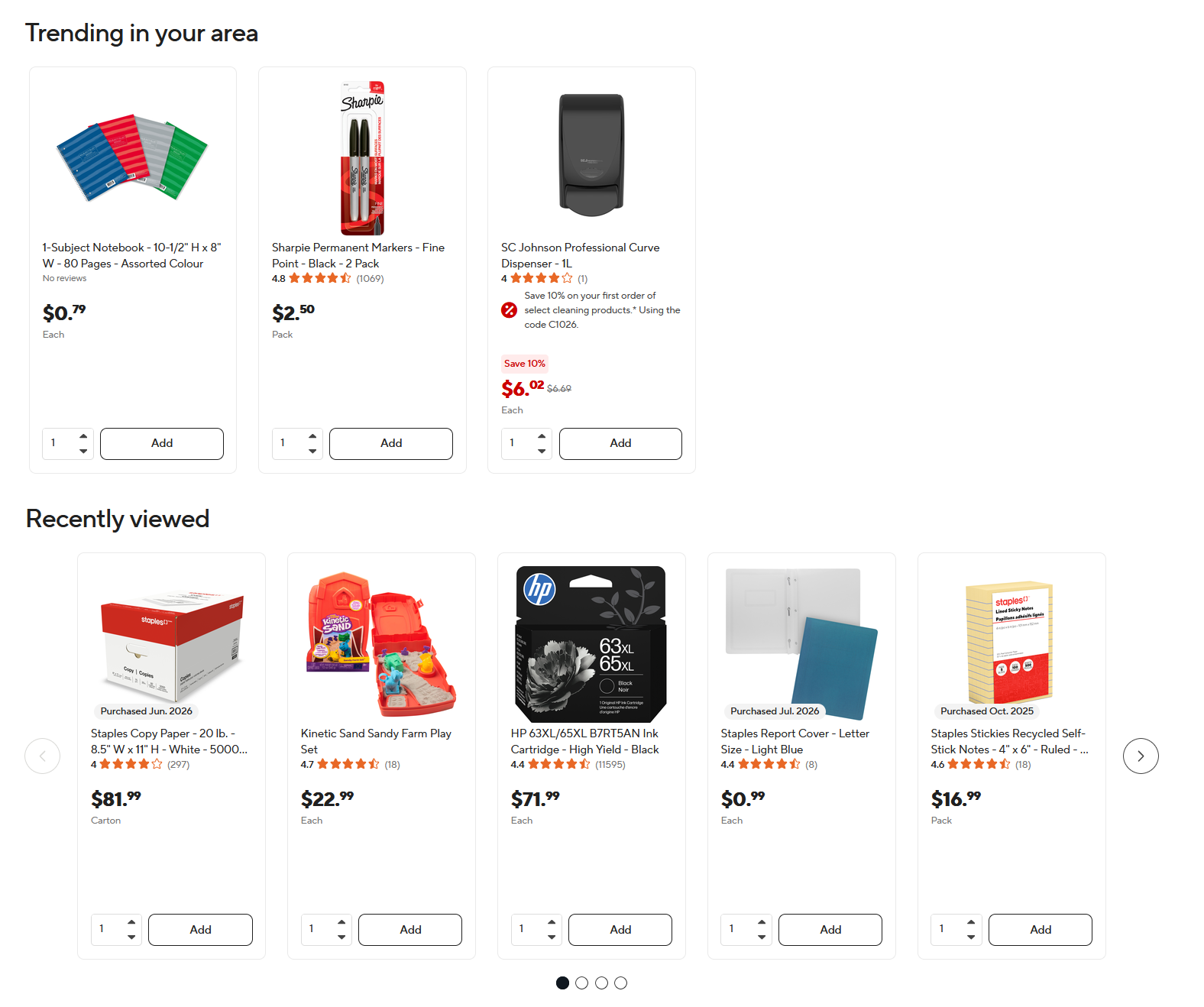
Each Eway client can personalise their experience. For example, a company could have its own banner, custom text, custom relationship-manager contact number, and only see promotions in Facilities rather than Furniture.
To preserve this customised text within a standard pre-login and post-login redesign, we added an HTML injection. The page structure became a sandwich: redesign components hosted via Contentful, HTML hosted via the legacy CMS, then more redesign components.
Design inconsistencies
Some components did not consistently match the intended hierarchy or visual system.
- Vendors would pay extra to secure spots on the homepage.
- They would lose the spotlight in the current setup because they were part of the lower mosaic, which generally received fewer than 15 clicks a day.
- We decided to give vendors their own banner and spotlight, incentivizing partner vendors to purchase more visibility for their products.
- Spacing between a title component and a row of promotion cards or banners was too small.
Outcome
The migration moved 20+ homepage components into a more reusable Contentful structure while establishing a clearer hierarchy for search, account access, product browsing, and secondary merchandising content.
Through UAT, I worked across Product, UX, and Development to identify and prioritize functional, responsive, visual, and configuration issues ahead of launch. The resulting component structure also gave Site Operations greater flexibility to manage recurring homepage campaigns without rebuilding the experience from scratch.
What I learned
This project reinforced that platform migrations shouldn’t automatically be treated as one-to-one rebuilds. Even when the primary business requirement is technical, auditing what already exists can uncover opportunities to improve hierarchy, maintainability, and the customer journey at the same time.
If I were taking the work further, I would establish baseline analytics before launch and measure search engagement, category interaction, guest-shopping starts, and downstream conversion after release to validate whether the new hierarchy changed customer behaviour.